Designing a Room for a Ghost
Ordinarily, when we embark on a new interior design project, there is a client and a brief– that goes without saying. But when Sisällä was selected as one of the designers on the wonderfully eclectic Como By Design showhome, it soon became clear that this project would run a little differently. Yes, there was a brief, but it was purposely vague to allow for unbounded creativity. And yes, in a manner of speaking, there was a client – only this time, it was a ghost.
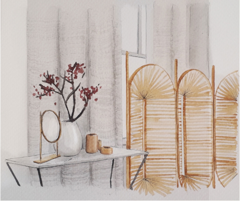
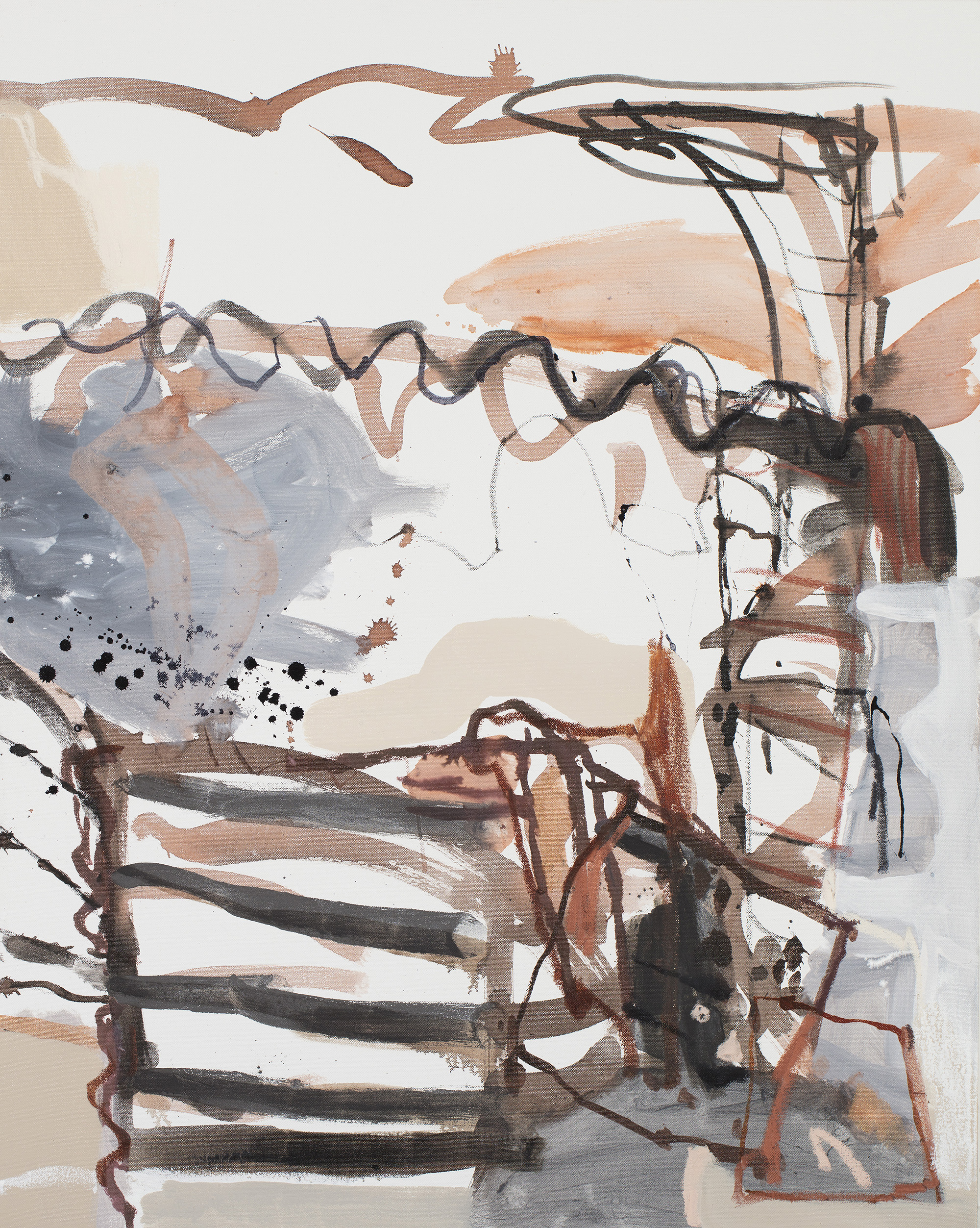
We wanted our room to be about shape and texture to allow the individual pieces to work together. We kept a neutral colour scheme so that the pieces would layer together well.
Sisällä was allocated one room in the beautiful Como House in South Yarra, a bedroom, and as soon as the brief was in, I was excited to start the process. The only problem was, the design process we embody here at Sisällä usually begins with the client.
I typically design spaces that are inherently focused on the client. The end result always reflects their lifestyle, taste, aspirations and travels, and it’s my job to tease out what these key elements mean for the client and translate them into design. But what do you do if the client is, in fact, a ghost?
You bring it back to life. In order to have a frank conversation with my elusive client, I put my imagination to work and recreated an idea of exactly who would have inhabited our designated bedroom. The task at hand was essentially to personify the ghost and afford it a lifestyle, taste, travel history and set of aspirations of its own.
It may sound like the Como by Design project has driven us slightly insane here at Sisällä. But the designs were not based purely on figments of my imagination, but also on a huge amount of research I did on the rich history of Como House.
I soon discovered that the ghost was, in fact, an inspiring woman named Caroline Armytage, mother of ten and pastoral property manager. In 1876, a year after her husband passed away, when she was just forty-four, she (or rather, her servants) packed up her belongings and she left Como House to travel the world for four years – children, trunks and two cows in tow. Needless to say, my admiration for the ghost grew with every word I read.
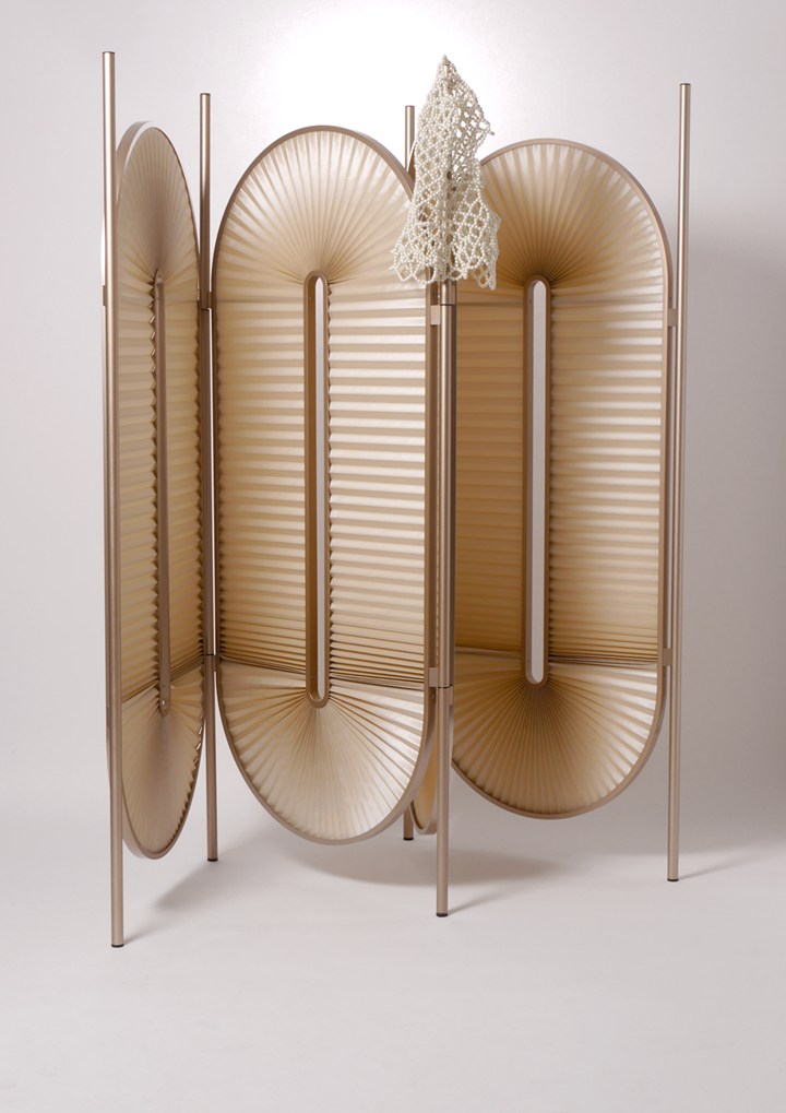
This screen by German designers Dante Goods & Bads is new to Domo and we’re so thrilled that we can access this now here in Melbourne!
She was brave, spirited, adventurous – maybe even a tad crazy – and spent life in search of beauty and inspiration. She travelled Morocco, India, Egypt, Japan, Russia, China and Europe. Along the way, she collected a vast array of precious pieces (many of which remain in Como House still today) including mirrors, vases, chandeliers, furniture from the Paris International Exhibition in 1878 and much more.
It became clear that only the finest design would suit a woman like Caroline, and thus the room had to be nothing short of spectacular. If Caroline went to great lengths to bring all the best pieces from around the world into Como House, well then so would I.
In conceptualising the design, I focused on an eclectic mix of contemporary pieces of our time combined with mid-century classics. I then layered them with the original antique pieces in Como House. Coordinating so many eras into a single design meant the colour palette needed to be neutral to sustain a harmonious aesthetic – which was a challenge for me, because I usually love injecting colour into my designs. Instead, I focused on blending together interesting textures, shapes and materials from past and present.
With a clearer vision of who the client was and what she might have wanted, the blank canvas before me fast transformed into a beautifully detailed interior design concept, layered with historical meaning and contemporary relevance.
A bed canopy adds a touch of the romantic, and a nod to the historical context of the building. And well, to be honest I’ve never had the opportunity to do one before!
I wanted to create a sanctuary for my client, a private bedroom away from the more public spaces of the house. Como House has many sitting rooms, a ballroom, lounge areas and even a billiards room – which makes sense seeing as the Armytage family had a reputation for hosting brilliant parties for Melbourne’s elite. Rumour has it they even had Dame Nellie Melba sing at a soiree of theirs. So in the end, the bedroom was designed as a calm but beautiful space for Caroline alone to enjoy.
And you know, I think she would have.
Next, all I needed to do was get to work sourcing all the right pieces and materials to prepare for Como by Design’s grand opening on 18th October. More to be revealed soon…
Our favorite suppliers have really been fantastic to work with for this project, and I’m so happy to share their details.
Wall Panel Fabrication | Plane Architectural Joinery
Sisal Flooring | Prestige Carpets
Wallpaper | Phillip Jeffries from The Textile Company
Wallpaper install | Prestige Wallpapering
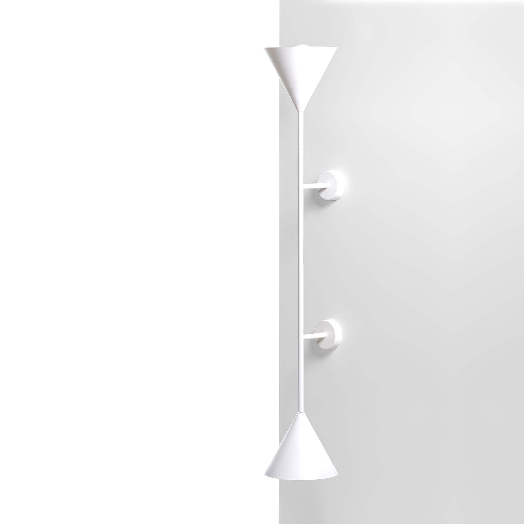
Wall Lights | LAAL
Bedhead and soft furnishings | BQ Design
Window Furnishings | Barlow & Hunt
Fabrics | Unique Fabrics
Cushion Feature Fabric | Pintura Studio from Motivo
Screen | Domo
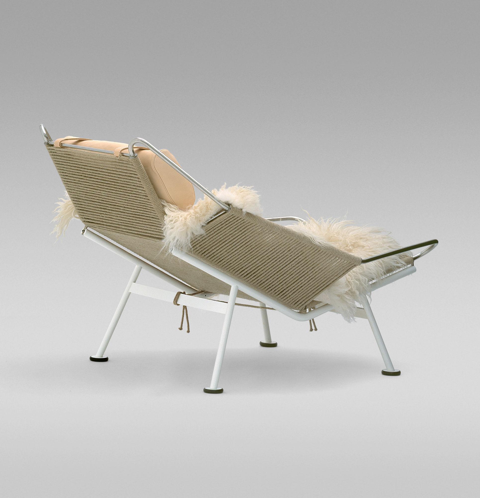
Flag Halyard Chair | Great Dane
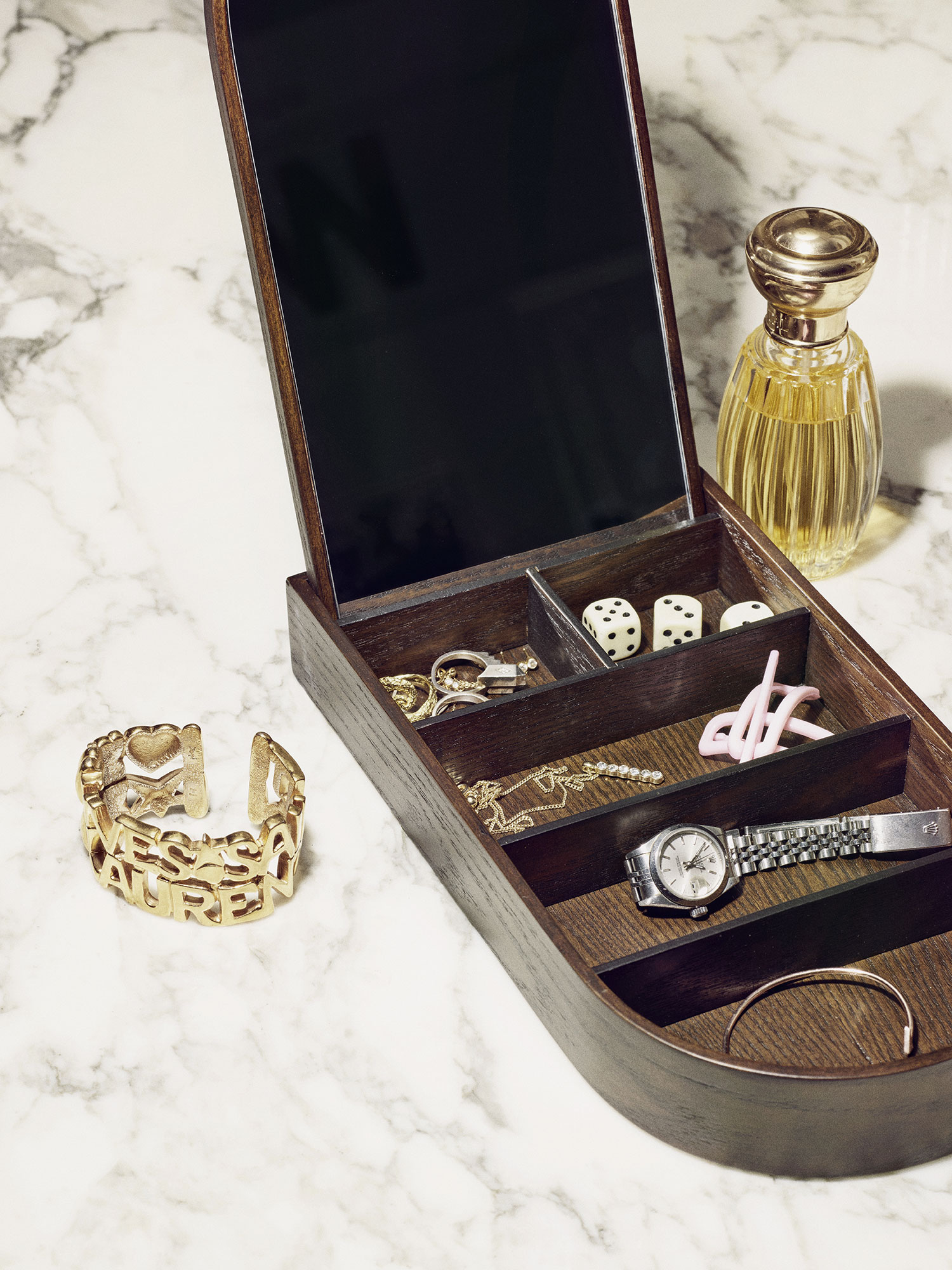
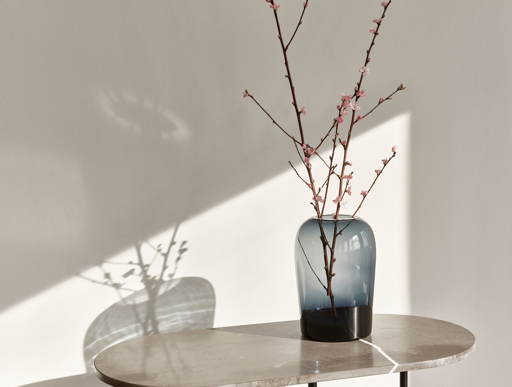
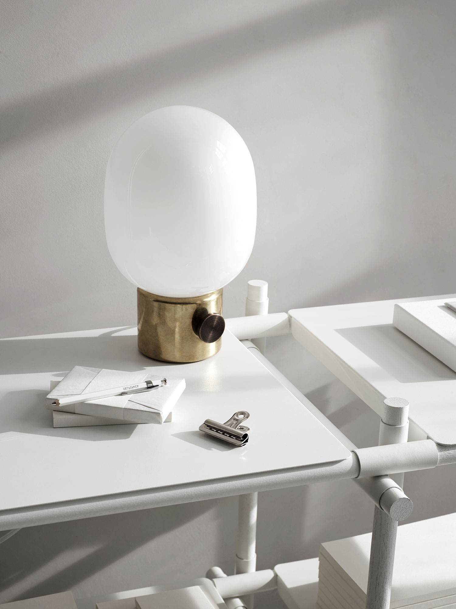
Side Tables, Table Light and Table Mirror | Hub
Bedhead Fabric | Instyle
Accessories & Decor | The Apartment

