Modern Mediterranean Is Having A Moment
We’ve found ourselves swooning, pinning and sharing a swathe of Mediterranean-inspired interiors of late – think that summery, relaxed seaside vibes and souq treasures, but with a contemporary clean edge.
In the timely spirit of sharing, today our interiors columnist, Lauren Li translates some of our favourite spaces inspired by this covetable aesthetic – found from Morocco’s deserts to France’s Cote d’Azur, and even where it’s popped up in Oz!
Finally (in Melbourne at least), we’re beginning to get a taste of hot sunny days and balmy nights, and we’re dreaming about what the summer may hold. Summer is the sound of crickets, the feel of hot sand beneath our feet, and the taste of sangria. We begin to wonder how we can translate these summer feels to the home.
With its terracotta tiles and white washed walls, the interiors of the Mediterranean have been hugely influential throughout history, more recently in the 80s, and are having quite a moment right now. It’s easy to see why.
These interiors are both sumptuous and minimalist, there is a focus on tactile combinations of materials in terracotta, stone, brick, glass and concrete. There is a noticeable absence of timber, which is a departure from the Scandinavian influence we’ve seen dominate our interiors. Rather than timber floors, we see stone and tiled floors, whilst furniture in cane and rattan is prominent. There is also an emphasis on strong geometric forms (yep, more arches!) along with organic, curved walls, which soften the minimalist aesthetic.
Let’s dive into it, shall we?
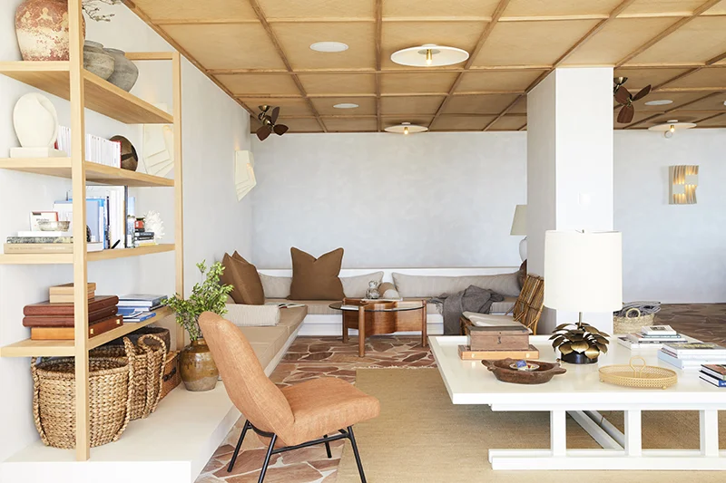
The Les Roches Rouges, lobby. A flagstone floor gives this minimal space loads of interest and warmth. The interior furnishings are all derived from the natural colour of the stone to create a serene tonal space. Photo – Nicole Franzen.
(left) Willow Urban Retreat, Melbourne. Photo – Sharyn Cairns. (right) You can bring this Modern Mediterranean feel to your place with decor pieces like these gorgeous terrazzo objects by Addition Studio. Neue Void Incense Burner from Addition Studio. Photo – courtesy of Addition Studio.
Stone
The Mediterranean look is all about hard materials and an abundance of gorgeous stone. Travertine is one of the softer stones, both literally and aesthetically. It has a delicious creamy colour and when honed and unfilled the texture full of little holes can be appreciated. It’s an ideal stone for outdoor paving (as it doesn’t get too hot) and makes a striking wall cladding or around a fireplace. Travertine is tactile so it’s a lovely stone for décor pieces or plates. The warmer colours in stone are a welcome change from they cool grey of Carrara and Elba marble we’ve seen dominate interiors.
(left) From NGV’s Rigg Interior Design Awards and exhibition, The Table Is The Base by Hecker Guthrie. Photo – Shannon McGrath. (right) Inside the Freshwater Apartment by John Wardle Architects. Photo –Sharyn Cairns, courtesy of the Australian Interior Design Awards.
Colour
I don’t need to tell you that the colour terracotta has been a huge trend across fashion and interiors. I think we’re drawn to terracotta because of its warmth, familiarity and honesty. For me, it also holds nostalgia of growing up in the 80/90s (anyone else have a Tuscan terracotta vase with a raffia bow, or a terracotta cherub?).
The entire spectrum of terracotta has been seen in interiors from pinkish tones through to dark brown clay. There are combinations of beige, ochre, sienna through to burgundy and freshened up with white. The colour combinations are tonal rather than contrasting. The smallest amount of blue looks great, just don’t get carried away.
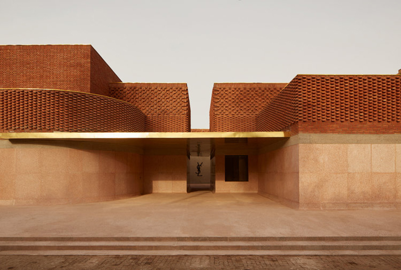
The incredible Yves Saint Laurent Museum, Marrakech. Photo – courtesy of the museum.
Bentwood Cafe, Melbourne, by Ritz & Ghougassian. Photo – Tom Blachford.
Bentwood Cafe, Melbourne, by Ritz & Ghougassian. Photo – Tom Blachford.
Brick
The humble brick continues to be reimagined in new ways, from appearing as patterned lacework in building exteriors, to being integrated into joinery and everything in between.
The incredible Yves Saint Laurent Museum in Marrakech, designed by French firm Studio KO is EVERYTHING. The façade of the museum is clad in a delicate use of brick, inspired by woven textiles.
What does a museum have to do with the interiors of our homes I hear you ask? A design like this museum causes a ripple effect is so far-reaching that it influences us when we’re making a decision about tiles for our bathroom renovation (you know that blue sweater scene in The Devil Wears Prada?).
We’ve recently seen bricks used for flooring (mid-century vibes) and more interesting than the usual timber. Ritz & Ghougassian used brick floors in their Fitzroy café Bentwood combined with deep terracotta coloured ceiling. It feels warm and familiar, yet effortlessly cool.
Willow Urban Retreat, Melbourne. Photo – Sharyn Cairns.
Willow Urban Retreat, Melbourne. Photo – Sharyn Cairns.
Willow Urban Retreat, Melbourne. Photo – Sharyn Cairns.
Plaster finish
New Melbourne wellness centre Willow Urban Retreat channels sophisticated modern Mediterranean vibes. The look is minimal, it’s defiantly not cold, thanks to the soft effect created by a polished plaster known as Tadelakt. The beautiful texture continues around curved walls seamlessly, and allows for the smooth elements to flow into another. This finish is very hardwearing and can be used on the walls and benchtops for wet areas. Tadelakt shows evidence of the human hands that have applied it – another ‘perfect imperfection’ that adds warmth to a space.
The seamless nature of this polished plaster is most effective when singularly applied throughout an entire space. It can be applied everywhere: walls, ceiling and even shelving, bench seats and niches.
The texture is allowed to be the hero of the space, which creates a quiet and sumptuous effect.
(left) Tigmi Trading‘s design in the new Habitat Byron Bay showroom. Photo – Alicia Taylor Photography. (right) Villa E is both sumptuous and minimalist. Renowned Studio KO designed this property, pictured with a beautiful Moroccan rug from Tigmi Trading. Photo – Alicia Taylor Photography.
(left) A hard stone floor is softened by gorgeous plush wool rugs. The Tigmi Trading‘s range in Villa E by Studio KO, Morocco. Photo – Alicia Taylor Photography. (right) Tigmi Trading shot their latest campaign for their traditional, vintage rugs at Villa E in Morocco! Photo – Alicia Taylor Photography.
The Moroccan Rug
A great rug is the essential ingredient to contrast with the hard materials in this modern Mediterranean look.
We’re already familiar with the gorgeous Moroccan rug that has been an anchor in interior design for years now, again again, part of its charm is the handmade, slightly imperfect feel. There is a lot more to Moroccan rugs than the diamond lines on a white background – we’re loving colours that are muted and earthy, bringing richness to a pared-back interior.
Brisbane-based architectural practice Richards & Spence employ the arch in many of their projects with The Calile Hotel no exception. The repetition of the arch and curved forms paired with a stong materials palette results in an identifiable aesthetic. Photo – Sean Fennessy.
The Calile Hotel by Richards & Spence in Brisbane. Photo – Sean Fennessy.
Curved Forms and Arches
Of course, it was the Ancient Romans that learned to refine the arch in architecture, which lead to the vault and dome. They probably never imagined that their solution to span wide openings would become a contemporary design trend, but here we are.
Whilst Mediterranean interiors may be sparse of decoration, the focus is firmly on the forms. The arch is employed for windows, doors, niches, whilst curved walls soften hard edges, and light falls softly on vaulted ceilings.
The interiors of The Les Roches Rouges are simultaneously rustic and chic. Photo – Nicole Franzen.
Golden collection. Sarah references a ‘strong sense of 70s and 80s nostalgia’. Photo – Dave Wheeler. Styling – Sarah Ellison.
Rattan
This Modern Mediterranean look is noticeably lacking in one key material: timber. Instead, we see rattan used in furniture, décor, lighting and even as a ceiling material. Rattan adds the warmth and the organic element that softens the hard materials. The rattan furniture looks great on a stone or tiled floor and suits the warmer climates. It may look a bit out of context in a carpeted room!
This article also appeared on The Designfiles, Lauren is the interior design contributor.


