How To Ace Apartment Living
That which is small can still be BIG on style…. plus size doesn’t have anything to do with creating a dreamy space that feels amazing to live in. We are of the firm belief that you can still live in a small ‘white box’, and fill it with life and personality too.
Today, I reflect on living to the fullest in small spaces, and offers up some clever tips to optimise apartment life!
(Above) Sophie Ashby of Studio Ashby and her husband Charlie Casely-Hayford live in this restored 1950s former BBC Television Centre Helios building in west London. Sophie designed the interiors to be versatile yet still with loads of interest and personality. The custom wall unit allows the artwork to slide across to reveal the TV. Photo – Alexander James. Interiors – Studio Ashby. Styling – Olivia Gregory.
I’m not talking about apartments today, I’m talking about homes. The kind of apartments that people actually live in, because apartments should not simply be financial packages. Apartments can be spaces with a personality just like a house, and look beyond the bare, white wall ‘AirBnB’ aesthetic. I’m really excited about this story, because almost two years ago we moved from our little place by the beach to an inner-city apartment. Our little family loves it.
Sure, apartment living is not for everyone, however all around the world, from Stockholm to Hong Kong, New York to Paris, families are living in apartments. Here in Australia, we are building a lot of apartments (there are 123 cranes in the sky in the Melbourne CBD and 60% of the construction is residential) but there is still a mindset that a family with kids need a backyard and white picket fence.
However, a strange thing is happening. Australia builds some of the biggest houses in the world and at the same time, there are fewer people living in each house than ever before. Picture big houses sprawled out at the edges of the city, with a sprinkling of people living alone. To me, that sounds quite lonely. Apartment living, on the other hand, has the ability to foster real community. In an apartment building, when we step outside our door, we see people and, quite surprisingly, we see the same people. And this, folks, is where community begins.
It’s kind of nice walking down the street and waving at Jags, our friendly coffee guy, or glimpsing through the window to see Joey cutting hair. Or walking past the window of the Chinese restaurant, as the chef chops off a roast duck’s head on the chopping block! Seeing these little interactions of life happening around my family feels good (maybe not the duck). Having people around also means great Neighbourhood Watch and that makes me feel very safe. Passive surveillance doesn’t happen so much on a quiet cul-de-sac where no one is around.
I know what you’re thinking ‘those poor kids need a backyard’. You’re right, we don’t have our own backyard, so our backyard is Fawkner Park. It can be an effort to get out of the house, and go to the park but once we’re there, we absolutely love it. Our kids know half of the kids there from school and childcare, so it ends up being an accidental playdate. They are sociable little people! Maybe one day we might move, but for now, this suits us perfectly.
Below are some reflections on how we’ve optimised the space we have, and tips for you to do the same too!
(Left) Sophie didn’t let the compact space stop her from decorating in her signature maximalist style with patterns, colours and gorgeous moments everywhere. Photo – Alexander James. Interiors – Studio Ashby. Styling – Olivia Gregory. (Right) The small entry of Marcus Hay’s former New York apartment didn’t stop him from thinking big when displaying artwork. This entry is decorated like a gallery and although small, it is rich in stories and layers. Interiors – Marcus Hay. Photo – Jonny Valiant.
The living room, which gets flooded with natural light. ‘Meditating is a big part of my world, so it’s a beautiful spot to sit in the mornings with the sun falling on your face,’ Paris explains. Interiors – Marcus Hay. Photo – Caitlin Mills for The Design Files.
(left) Paris had this sofa made specifically for her Collingwood apartment and it looks like she’s chosen comfort and style in equal measure. Photo – Caitlin Mills for The Design Files. (right) A city girl ‘through and through’, Paris has lived between warehouses and apartments her whole life. This has encouraged a very thorough ‘less is more’ mindset when it comes to her living spaces – who knew bathrooms this minimal could exist?! Photo – Caitlin Mills for The Design Files.
Think Big
The number one mistake that you can make in a small space, is to fill it with tiny furniture. It may seem counter-intuitive to have one large comfortable sofa in a small space, however it’s better than a few small armchairs.
Rather than have lots of smaller pieces cluttering up a small space, go for fewer, larger pieces. Same goes for artwork – just because a room is on the small side, doesn’t mean you can’t go floor to ceiling with a WOW factor painting or print. In many spaces, a hero artwork like this can actually make the room feel bigger, not to mention adding character and personality.
(left) A study nook doubles as a display shelf, which I’m sure inspires Marcus Hay when he’s working on new concepts! Interiors – Marcus Hay. Photo – Jonny Valiant. (right) The eclectic New York apartment of Australian super-stylist Marcus Hay has made every inch count. The pinboard above the desk creates a ‘home office’ within the main living area. Interiors – Marcus Hay. Photo – Jonny Valiant.
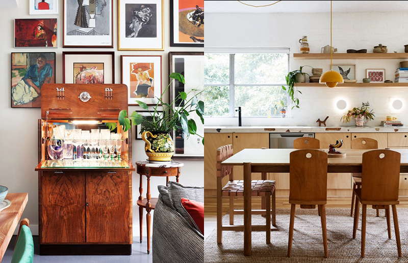
(left) A vintage cabinet doubles as a mini bar – and there you have it, an instant party! Photo – Alexander James. Interiors – Studio Ashby. Styling – Olivia Gregory. (right) Our Art Director’s Tiny Terrazzo Palazzo! Kitchen table made by Thomas Lentini. Woven leather chair by Douglas and Bec. The chairs in-between are second hand. The mustard hanging pendant light is Verner Panton’s Flowerpot lamp, from &tradition. Photo – Caitlin Mills. Styling – Annie Portelli.
Versatility & Zoning Areas
Just because a space may be small, doesn’t mean that you can’t create distinct zones. A pendant light over a dining table delineates the space, and creates a sense of occasion. A desk with a pinboard over it creates a ‘home office’. A ‘non-area’ like a hallway can be decorated with artwork to create a gorgeous little entry moment – every inch should be considered.
Think about dual-purpose furniture such as a coffee table that doubles as a toy box, a bench seat with baskets under and a dining table with a fold-out leaf to extend when using it as a desk. Even a bare wall can store bags with a few hooks installed.
(left) That blue!!! What a gorgeous cosy space to enjoy breakfast whilst the world goes by outside in the Big Apple. Interiors – Marcus Hay. Photo – Jonny Valiant. (right) If these walls could talk, they would say that a fabulous couple live here. Yellow is such a joyous colour to paint a bedroom because life is too short for boring spaces. Photo – Alexander James. Interiors – Studio Ashby. Styling – Olivia Gregory.
(left) The dining room. How incredible is that blush feature wall? Painting by Neil Tomkins. Sculpture by Sanné Mestrom. Tulip dining table by Saarinen. Restored Cesca-style chairs. Pendant by Laal. Herringbone floors by Storey. Photo – Sean Fennessy. Styling – Jessica Lillico. (right) Matt Woods Perfect Storm. The grey walls add to the enveloping effect to this bedroom in this incredible apartment by Matt Woods. Photo – Kat Lu.
(above) This apartment in Southbank is one of (very) many, however, not many of them have a cosy bedroom like this! The soft grey grasscloth wallpaper and sheer curtains give this bedroom a bespoke and luxurious feel – a far cry from the white ‘AirBnB’ room aesthetic. Interiors – Berkeley Interiors. Photo – Tess Kelly.
Colour
White isn’t always the best colour in small spaces, believe it or not! In a compact apartment, particularly where natural light is limited, darker colours actually recede, creating the illusion of depth, and helping to make artwork and furniture pop. Using different wall colours in each room can also make a home feel bigger, because of the variety.
So, instead of bland white, embrace colour where you can, then add in some mood lighting and you’ve got loads of atmosphere.
(left) A floor lamp next to the armchair gives a beautiful ambient light in the evenings. Photo – Alexander James. Interiors – Studio Ashby. Styling – Olivia Gregory. (right) Lighting is not an afterthought in this lofty apartment designed by Matt Woods, it integral to the overall design of the space. I can only imagine how this double ring of light would softly illuminate the space in the evening – it’s so gorgeous. Photo – Kat Lu.
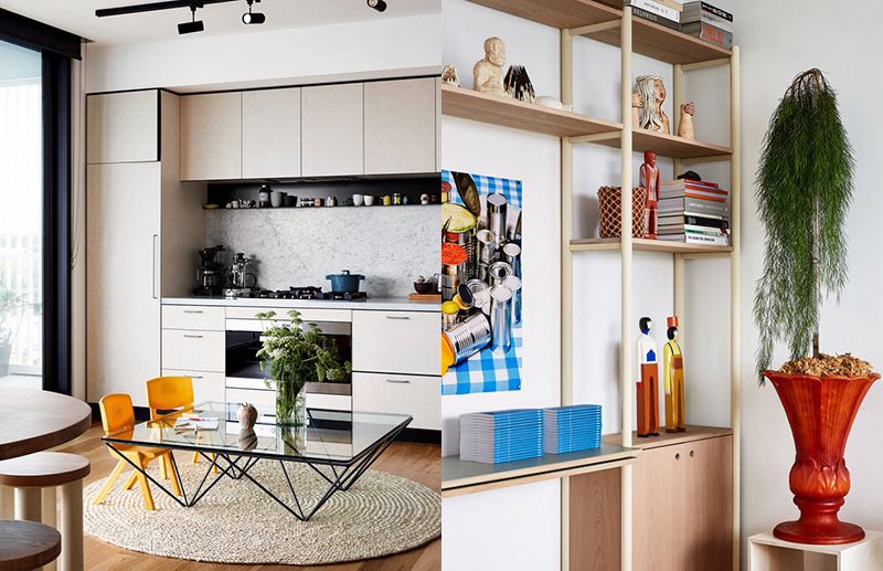
(left) Our Art Director’s Tiny Terrazzo Palazzo! In amongst the bits and bobs on the shelf is a swan watercolour by Annie’s Dad when he was in high school. Beside it (right) sits Alice Oehr’s annual Christmas cards, with wall lights from Beacon Lighting. Photo – Caitlin Mills. Styling – Annie Portelli.
Lighting
New apartments developments often lack character, big time. A major issue is that they’re usually severely lacking in lighting – most only have a grid of downlights – literally the worst way to light a room!
One way to add interest is to use wall lights (even if you’re renting, as some wall light options don’t need to be hardwired). Also experiment with floor lamps and table lamps at the very least, you can thank me later!
Instead of wall to wall storage, some breathing space can greatly enhance the overall feel of the apartment as seen in this interior by The Stella Collective. Interiors – The Stella Collective. Photo – Maegan Brown.
Wall to wall cupboards are all well and good, but it’s what’s inside that counts. The inside of this pantry has been designed by The Stella Collective specifically for purpose to provide maximum efficiency in the apartment. Interiors – The Stella Collective. Photo – Maegan Brown.
(left) Even the kids’ dining area is chic! Cooking pot from Hub General Store. Photo – Caitlin Mills. Styling – Annie Portelli. (right) Shelf/desk wall designed in collaboration with and made by AKWT painted in a Dulux Chalk Finish paint. Ceramics on top shelves made by Georgie at age 12. Kate Jones ceramic planter. Mark Alsweiler statues. Photo – Caitlin Mills. Styling – Annie Portelli.
Design Clever
You can store everything you need in a small apartment with some clever design solutions and a shift in mindset. Well-designed cupboards can store coats, appliances and even a laundry. Often, to maximize the efficiency of space, they may need to be custom made.
It’s also worth considering that some breathing space can greatly enhance the overall feel of the apartment, so putting cupboards on every single wall isn’t always the best solution either; sometimes just having less stuff is.
This article also appears in The Designfiles, Lauren is the interior design contributor.


