Two Inspiring Kitchen Transformations - From Affordable Update To Complete Overhaul!
Should it stay, or should it go? That is the first question that we need to ask when we are renovating a kitchen. But what is ‘it’ exactly? Do we keep the general layout of the kitchen, but remove all of the cupboards? Do we keep the appliances but relocate the entire kitchen? Before we begin the design process, we need to explore if there are any elements of the existing kitchen that we want to retain. What works, and what doesn’t?
It is wonderful to start with a carte blanche, but this is not always the case. It can seem very wasteful to throw away a perfectly functional kitchen, just because we don’t like how it looks anymore. Sometimes we need to meet somewhere halfway.
Today, our brilliant interiors columnist Lauren Li of Sisällä Interior Design takes us through two very different, but equally inspiring kitchen transformations!
Kitchen 1: Complete Overhaul
After an incident of a guest putting the electric kettle onto the gas cooktop (oops!), which caused a lot of smoke and damage, it was time for a whole new kitchen.
The clients renovated this Edwardian home in the late nineties, and it had seen her children grow up and eventually move out. Their needs have changed, and they wanted their space to reflect that.
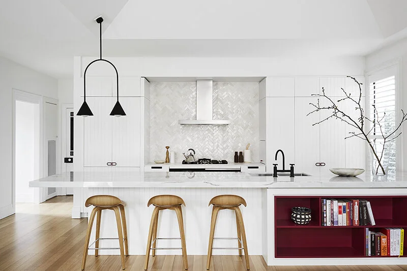
Pendant light: Conehome Single Arch by LAAL. Tiles: Moroccan Bijmat from Earp Bros and installed by Baz of National Tilers. Tapware: Astra Walker. Gubi Stools: In Good Company. Wall and Cabinet: Dulux Natural White, accent Dulux Ripe Rubarb. Handles: Custom. Benchtops: cooktop Zenith by Dekton from Cosentino. Kitchen fabricated by Plane Architectural Joinery. Photo – Tess Kelly.
What they wanted:
The clients wanted to include a wine fridge, and they wanted to continue to use the kitchen as a space to entertain when friends and neighbours dropped over. Apart from that, they left the rest up to me – #dreamclient!
What to keep:
There were a few things that they wanted to retain: the existing layout, the rangehood (it was brand new as the existing one was damaged in the kettle fire) and existing walk-in-pantry that suited them well.
What we did:
I wanted the space to look fresh and yet feel warm. It needed to be welcoming and chic just like the client herself, so we introduced a bold raspberry accent colour (onto the mostly white kitchen – we chose Dulux Ripe Rhubarb to accent Dulux Natural White). This colour featured in a few pieces of art that the clients owned, and it lends an element of the unexpected in this mostly white kitchen.
Pendant light: Conehome Single Arch by LAAL. Tiles: Moroccan Bijmat from Earp Bros and installed by Baz of National Tilers. Tapware: Astra Walker. Gubi Stools: In Good Company. Wall and Cabinet: Dulux Natural White, accent Dulux Ripe Rubarb. Handles: Custom. Benchtops: cooktop Zenith by Dekton from Cosentino. Kitchen fabricated by Plane Architectural Joinery. Photo – Tess Kelly
Pendant light: Conehome Single Arch by LAAL. Tiles: Moroccan Bijmat from Earp Bros and installed by Baz of National Tilers. Tapware: Astra Walker. Gubi Stools: In Good Company. Wall and Cabinet: Dulux Natural White, accent Dulux Ripe Rubarb. Handles: Custom. Benchtops: cooktop Zenith by Dekton from Cosentino. Kitchen fabricated by Plane Architectural Joinery. Photo – Tess Kelly.
We extended the island bench to the wall, which allowed for some shelving to the front, as well as the wine fridge inside the kitchen. A beautiful slab of New York marble was selected for the island bench, worrying about stains isn’t this client’s style – life is too short! Although the kitchen is mostly white, texture plays a part in keeping it interesting. The cupboard fronts have a v-groove pattern and the white tiles (from Earp Bros) are handmade in Morocco, with a wonderful shimmering texture.
Having the fridge is concealed behind cupboard doors makes the whole kitchen feel more cohesive. We worked with Rob of Plane Architectural Joinery to bring this design to life!
Budget breakdown:
Custom made cabinetry, stone, plumbing and electrical work: $35,000
Sink and tap: $1,400
Appliances : $27,000
Lighting and misc: $5,000
Total $68,400
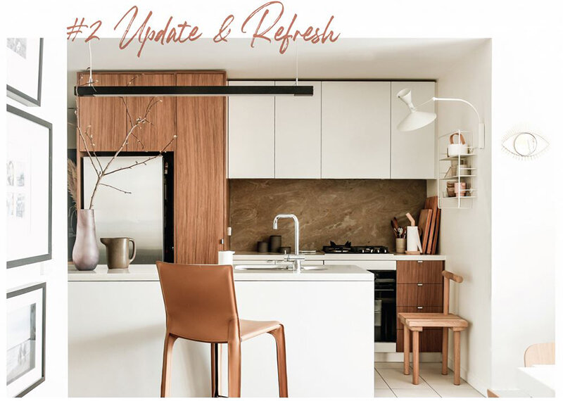
Stone splashback: Airslate from Earp Bros. Shelf: Coupe shelf from The Apartment. Light: Lampe de Marseilles from Lights Lights Lights. Stool: Cab stool by Cassina from Mobilia. Photo – sisalla
Kitchen 2: Update + Refresh
Funny how life in lockdown causes you to do those things that have bothered you for three years! This is my own kitchen in our inner-city apartment, and I wanted to give it a refresh. It’s about ten years old, it functions well and is generally in good condition. But I simply couldn’t stand that turquoise glass splashback for one more day. Being in stage four lockdown, having any trades into our home is not an option. So we got handy!
What we wanted:
I wanted a more neutral and contemporary kitchen space, where I could display some kitchen décor items and a few handmade ceramic pieces. I also wanted a better light source over the cooktop area.
What to keep:
We didn’t remove anything. The glass spashback is still there behind the new one! Thankfully the existing stone benchtop and cupboards are fairly neutral.
What we did:
We used a piece of Air Slate to cover the existing glass splashback. Air slate is between 2-4mm thick. It’s the thinnest natural stone surface covering available, and the fibreglass backing allows it to be flexible. It is quite amazing! It was delivered to our tiler Baz, who cut it to size, then an Uber delivered it to our home.
We used 3D Command velcro strips (yes, we are amateur DIY’ers!) to stick it directly onto the glass splashback. We then used a stone sealant to protect against any oil splatters. We didn’t need any trades to do this and it didn’t cost much money at all.
Stone splashback: Airslate from Earp Bros. Shelf: Coupe shelf from The Apartment. Light: Lampe de Marseilles from Lights Lights Lights. Stool: Cab stool by Cassina from Mobilia. Photo – sisalla.
For a little more storage, we installed a cute shelf onto the wall, and added a wall light. The lamp just plugs into a socket, no electrician needed!
Another affordable option for a low-cost new kitchen look is to ‘resurface’, by keeping the base of the old cupboards (the expensive bit!), but adding new cupboard doors – or even just new handles!
Budget breakdown:
Air Slate – cut and delivered: $600
Coupe Wall Shelf: $635
Lampe de Marseille Wall Light: $1100
Total $2,335
This article also appears in The Designfiles, Lauren is the interior design contributor.


